By Jiali Shao, University of Kansas
On June 10th, EPA released EJSCREEN, and environmental justice screening and mapping tool.
EJSCREENis a web-based tool that provides easy access to reports and maps. Unlike other mapping tools like ArcGIS or Google Map Pro, users don’t need to learn many mapping skills or install anything. As an environmental assessment student, I found it much easier to use than other software for environmental justice (EJ) research. Here is my experience:
EJSCREENis a web-based tool that provides easy access to reports and maps. Unlike other mapping tools like ArcGIS or Google Map Pro, users don’t need to learn many mapping skills or install anything. As an environmental assessment student, I found it much easier to use than other software for environmental justice (EJ) research. Here is my experience:
Before I opened the EJSCREEN web, I set an objective – to identify potential environmental justice issues in Kansas City, Kansas (KCK) area.
The interface looked very simple. But it had all basic elements of a mapping tool.
To begin using EJSCREEN, I typed “Kansas city, Kansas” in the upper right corner. The application listed possible matches for the input. I clicked the search icon; then the map zoomed to the location. EJSCREEN is a web-based tool so I had to save a bookmark for my work.
The next step was to select a specific area and search the report. I clicked the “Report on Selected Place” button and drew a contour of Kansas City, Kansas. If my object had been a smaller point, I could have set the buffer to 1 mile to include all residents who were living inside the buffer area.
Next, I clicked “Explore Reports”. It gave me the data categories of 12 Environmental Justice Indexes, 12 Environmental Indicators and 7 Demographic Indicators. I could also see the comparison between the population percentiles of state, region (EPA Region 7) and the user specific area.
One limitation of EJSCREEN is that it cannot include every environmental indicator. For example, drinking water quality and indoor air quality were not available with adequate quality, coverage and resolution to be included in this national screening tool.
To get an American Community Survey (ACS) summary census report, I clicked “Get Printable Standard Report”. 30 seconds later, I got a report including population by race, sex, age, educational attainment and the income of the area I selected. These data were very useful for understanding basic demographic and environmental facts about KCK.
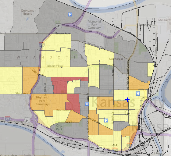
After analyzing the report, I clicked “Map Data-Map EJ index” in the toolbar to make a map. I chose PM2.5 index and clicked the small arrow to change the transparency so I could see the street names. The PM data used is a fusion of model and monitor data, something important to know when evaluating the results delivered by the tool. With the legend in the upper right corner, I could see which census blocks might have a PM 2.5 problem.
Then I clicked “demographic indicators” to get another map with low income data. The visible comparison of these two maps showed me if there was a potential relevance between these data.
I tried to put some supplementary layers into the map. For example, I clicked “Places-Hospitals”. The map showed me all hospitals in KCK. This tool also allowed me to add data layers from other websites if necessary.
. 
I like this tool because it is quick and easy to use and it is more specific for researching environmental justice issues than other tools. With EJSCREEN it takes users just 5 minutes to get the information they need and put them together. Citizen scientists and others can use EJSCREEN to learn about an area, to write a paper or a report, or make a presentation about their community.
EJSCREEN is not perfect. The biggest problem to me is the timeliness of the information.. All environmental indexes were at least two years old. It would be better if these data were updated more frequently, ideally monthly or quarterly. And all monitoring points should be marked in the map if possible.
EJSCREEN would be more useful if supplementary layers for high pollution factories or other point sources were included. Without that data, the user needs to know a lot about the area to understand environmental impacts. A near-real time capability would be very valuable, so that, for example, the EPA could identify the site of a pipeline rupture, and news media could include a link to an EJSCREEN map showing its location.
EJSCREEN allows users to add additional data layers. Because it is new software, there are only a few web maps for EJSCREEN to add. If other organizations could upload and share their EJSCREEN maps, EJSCREEN would be more useful to find out environmental justice issues.
————————————
The author, Jiali Shao, is a University of Kansas (KU) graduate student who grew up China. He is a student in the Professional Science Master’s in Environmental Assessment program at the KU Edwards campus, and a Diesel Health Project intern.
